Meet the Artists of the 2017 Printed Program
Posted Tue 11th Jul 2017 | efront
Adit Wardhana
Building: 41X
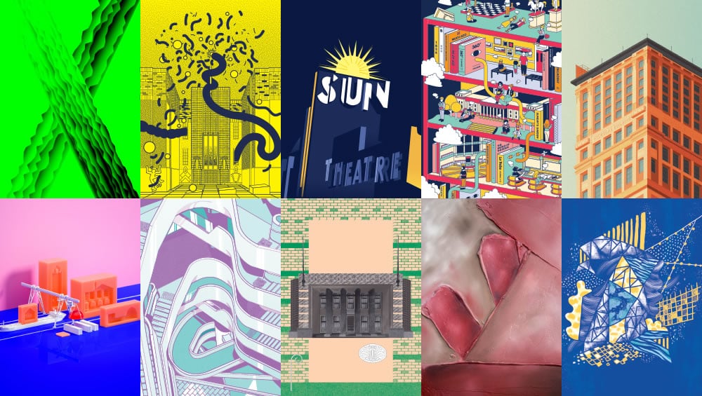
This typography representation of 41X took inspiration from the unique and bold facade, celebrating the idea of joining together a public and commercial building. The façade design helps contribute to 41X’s energy efficiency, featuring precast concrete panels of complex geometry and faceted green anodised aluminium represented through the letter X.
Design & Other
Building: Collingwood Arts Precinct
There is eclectic beauty in this dilapidated building that sits on Johnston Street in Collingwood; the symmetry of the entrance, its many windows, and the conflicting sections of brickwork. It lies solidly on the hill, a dormant beast hungry for creative combustion. Keith Haring’s iconic mural adorns one side of the building, brought back to life recently, as vivid and engaging as it was in 1984. Reimagining one of the most visceral elements of Haring’s mural – the caterpillar – our illustration celebrates the impending creative revival of this wonderfully eccentric space.
About Design & Other:
Design and Other is a creative partnership between designers Cameron Lofthouse and Monica Placella from Melbourne, Australia. Founded in 2009, the ongoing project places an emphasis on independence, fluidity and collaboration and has seen Lofthouse and Placella complete a wide span of projects both locally and abroad. Their work merges computer-based and handmade design processes and investigates the interface between art and design practice.
Instagram: instagram.com/designandother/
Elise Lampe
Building: Sun Theatre
The architecture of the theatre inspired my Art Deco poster style response. The deconstructed elements of the building further emphasise the graphic style of this era. I chose to capture the building at night when the sun lights ups the dark sky and the building is at its most iconic.
About Elise Lampe:
Matthew Chan
Building: State Library of Victoria
The State Library a place full of contrasts. Classic architecture in a contemporary environment, full of energy outside and serious with thought inside. It is a bustling place where creativity, energy and inquisition all collide in a colourful setting.
About Matthew Chan:
Mike MacMahon
Building: Nicholas Building
This illustration of Melbourne’s Nicholas Building took inspiration from the era in which it was built. Like the architecture, the isometric geometry and pastel colours reflect a sense of the 1920’s, with influences of the Chicago School style, and, more generally, a sense of prosperity in a young and growing capital city.
About Michael McMahon:
Michael is a freelance illustrator and designer currently working in Melbourne.
Instagram: instagram.com/_mikemcmahon/
Mr P Studios
Building: Mission to Seafarers
We were initially drawn to this building because of the amazing, orange, roof tiles and how they contrast with the bright, blue Melbourne sky.
After doing some quick research we realised that the seafarers who use this building are at sea for months at a time. Because of this extended time at sea we suspect that when they hit dry land they have legs like jelly! Which got us thinking more about jelly… It is a party dessert, a sugar filled, wobbly substance that cries out celebration and celebration is exactly what most seafarers do when they arrive in Melbourne at Seafarers House.
At first, we thought we would make the building out of jelly but this seemed wrong as jelly doesn’t last, it gets eaten! Instead, we opted for jelly moulds, which represent the Seafarers House and its open house policy for all to share and reuse – like a mould. The workers are the jelly – they bring life and fun to the building after being so long at sea.
Nic ‘Slumpy’ Falconer
Building: Medibank Place
Medibank Place in itself is full of life and vibrancy, I really wanted to capture this energy in my piece and make a work that was fun. The building is very perplexing, with twists and turns so incorporating these elements was crucial to the piece. I tried to convey a space that viewers may be intrigued by and drawn into exploring.
Oliver Elliott
Building: Royal Melbourne Regiment Drill Hall
With this piece, I wanted to elevate this proud and important building. To frame its strong, regimented forms and celebrate the elegant Art Deco palette. A building heavily relied on throughout the war effort, it deserves to be placed on a pedestal.
About Oliver Elliott:
Victoria FitzGerald
Building: Essendon Incinerator
When I researched the Essendon Incinerator I was first struck by the beautiful lines present in the structure; from the doorway leading to the intricate cut outs under the gable roof. I wanted to portray these strong lines in my work and to use earthy tones to embody the history of its use as an active incinerator.
About Victoria FitzGerald:
Victoria FitzGerald is an oil abstract artist exploring textural bases to start the painting process. Living in Wyndham Vale, Victoria works full time in Administration but finds time out of hours to paint. Victoria attended Gordon Tafe in Geelong to start a Diploma and Degree in Fine Art but the high costs associated with the degree was the catalyst to change ‘careers’. She has been painting since 2013 (after a 5-year break). During this time, Victoria has experimented with various mediums to find her unique style; starting with watercolours, moving to acrylic on paper and then into what she is currently using – oil on canvas.
Instagram: instagram.com/
Candy Yan Yan
Building: Federation Square
The conceptual design was inspired by the modern architecture of Federation Square—its lines, catenary lights, geometric urban shapes, sandstone surfaces, and glass surfaces that reflect its surroundings (trees and clouds).
About Candy Yan Yan:
Candy Ng is an illustrator and artist from Melbourne, Australia. Candy’s work has been described as whimsical and imaginative, filled with inspiration from nature, adventures and good thoughts.
Her illustrations have been exhibited at shows across Australia, New York and Berlin. When not at work, she explores the world with a sketchbook and a pen. Candy is happiest on her bicycle and aims to pat as many dogs as she can.
Instagram: instagram.com/yanyancandyng/
The 2017 Printed Program is available from Readings.


